
Table of Contents
There are more than 700 font styles in Microsoft Word. With hundreds of choices available, deciding the perfect one to use for your resume can be difficult. But does font choice really matter? It absolutely does! The way words are presented on your document can profoundly impact how they are interpreted by your readers. In fact, an experiment done on a New York Times article revealed that fonts can indeed have an impact on the way readers accept information.
According to the experiment results, fonts that inspire trust and belief make statements more likely to be accepted. The same is true in resume writing. A resume with fonts that are easy to read showcases professionalism, and Applicant Tracking System (ATS) friendly are more likely to be considered for an interview. So, choosing the right font is crucial to your application’s success. In this article, we have listed some of the best fonts you can use on your resume.
1) Recommended fonts for traditional industries
The work in traditional industries is typically time-consuming and strictly regulated. So, companies in these industries prefer a resume with a professional, serious, and straightforward feel and look. If you’re looking for a job in the banking, insurance, and legal sectors, we recommend going for a simple and conventional font style.
Serif fonts are considered more classic or formal. The small strokes attached to the main part of the letter give it a traditional look. So, these fonts are a perfect fit if you are looking for a job in the traditional industry. Some of the recommended fonts are Cambria, Times New Roman, Georgia, Garamond, and Palatino. These fonts are relatively easy to read and ATS-friendly, making them an excellent choice for resumes.
2) Recommended fonts for neutral industries
Neutral industries, such as healthcare, telco, and retail, are more flexible in terms of style preference. Companies in these sectors favor a traditional look but also appreciate some creativity. Hence, if you’re into these types of industries, use a font style that balances simplicity and ingenuity.
Unlike serif fonts, sans-serif does not have to extend features at the end of the strokes. These fonts offer a cleaner and more modern style, making them ideal for neutral industries. Arial, Helvetica Calibri, Tahoma, and Verdana are some of the recommended resume font styles that belong to the sans-serif font group. Their clean lines and sharp edges make them more legible. Additionally, these fonts are considered ATS and human reader-friendly.
3) Recommended fonts for progressive industries
Companies in the progressive industry, such as marketing, design, and technology, are more open to creativity. Decision-makers in these industries view your resume as a representative of your creative skills and abilities. Thus, fonts with simple and modern characteristics are highly recommended if you are targeting companies in the progressive industry.
Sans-serif fonts are commonly used to convey simplicity and modernity. The fonts have become prevalent for the display of texts on computer screens and headings on printed media. In fact, sans-serif fonts are a popular choice among high-profile brands in the progressive industry, including Facebook, Apple, and LinkedIn. Helvetica and Arial are the most used fonts in these industries. These fonts also work well with most ATS, which makes them excellent fonts to use in your resume.
Tips and Tricks for Choosing Fonts
After learning the recommended fonts to use in your resume, you might be thinking about how to start your font selection. While we have narrowed down the best ones for your resume, it can still be challenging to decide which specific font will help convey your message the most.
It can be tempting to choose a ton of fonts in an attempt to make your resume more visually appealing. However, this can do more harm than good. We recommend sticking with one to two different font styles. Anything more than that will make your resume look cluttered and difficult to read. Instead of overusing different font styles, we suggest doing the following:
- Use bold or italics to create emphasis.
- Utilize two to three different font colors to express creativity. However, make sure to stick to dark colors and keep it professional.
- Optimize font size for your resume. The ideal font size is between nine and twelve. Begin with a size nine font and experiment with sizing up if you still have enough space.
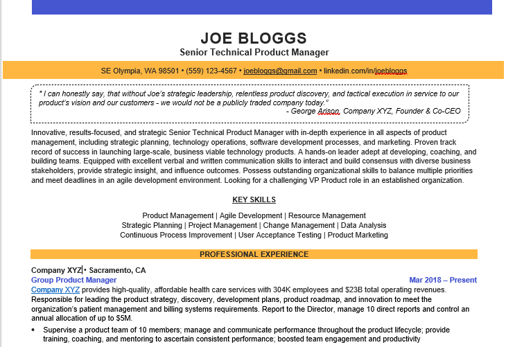
Here is an example of how you can do the above in practice.
The content of your resume has more weight to hiring decisions than your font choice. However, your font choice has an impact on your document’s presentation. So, it is still something you should think about when creating your resume. As a rule of thumb, the best font is easy to read and works well with ATS. This makes your resume accessible to decision-makers, maximizing your application outcome.


")


")
")